Connect with us
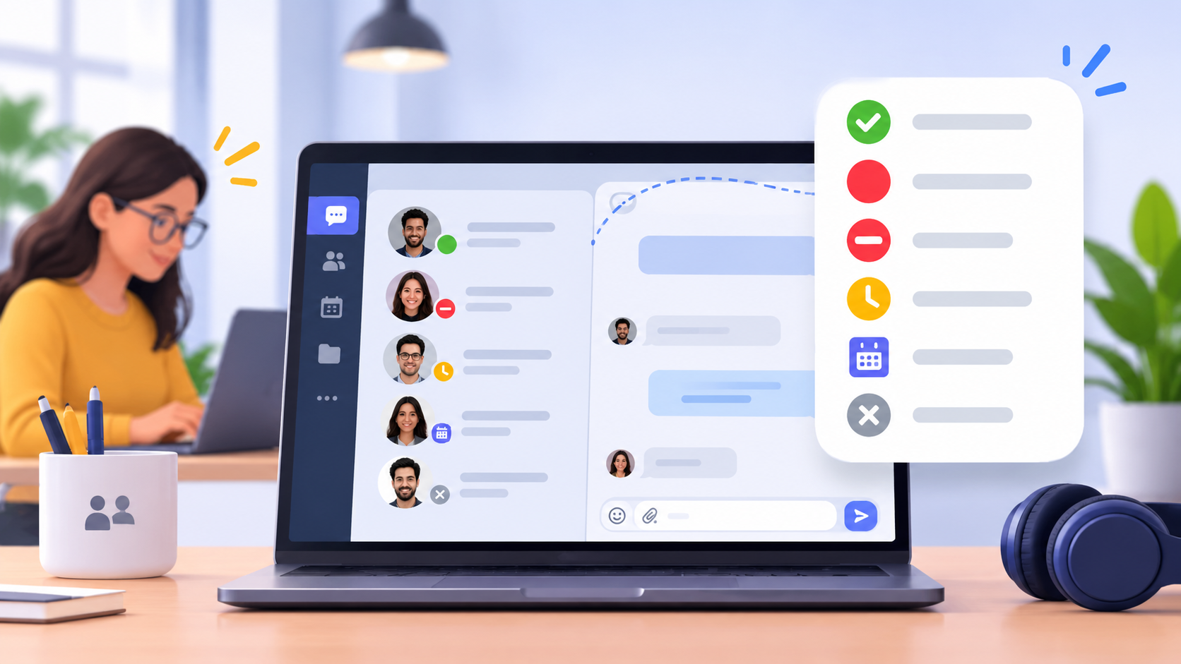
Status Icons in Team Chat: Small Symbols That Protect Focus
Remote teams are unable to look over a room to see who is occupied. That is now done by a small symbol beside a name. When the symbol is obvious, co-workers avoid unnecessary pings and guard the attention of one another. When vague, people have to guess, and that is super time-consuming. Let’s look into common status icons and the importance of labels. So, keep reading to learn how a team can create its own simple legend.
Why Small Symbols Matter for Focus
A closed door or a pair of headphones in an office serves as a signal for employees to wait while their colleague is busy. Chat tools should replace those cues with something that appears on the screen. The same signals are required in hybrid teams, as half the team might be off-site. Interruptions are costly, and research quantifies the cost.
Researcher Gloria Mark followed 36 knowledge workers around over a three-day period and logged every event. Interrupted work that restarted the same day took an average of 23 minutes and 15 seconds to restart, according to Gallup. The research is dated 2006, so consider the number an approximation.
Mark also found that people caused about 44% of their own interruptions. A clear status responds to a question before a person types it. That little saving is repeated daily in an entire team. These results indicate that some interruptions can be prevented before they actually occur by having clearer signals.
What Presence Icons Actually Say
Microsoft Teams is a good source of information, as it records every presence state. Microsoft Learn indicates that “Available” has a green check mark, and “Busy” has a solid red circle. “Do not disturb” icon adds a white line to the red circle. In this case, users continue to receive chat messages, but banner notifications remain hidden, Microsoft Learn notes. Incoming calls are sent to voicemail, preserving real focus time.
“Be right back” and “Away” have a single yellow symbol, which looks like a clock. According to Microsoft Learn, “Away” will automatically show up after a few minutes of inactivity or when the computer is locked. On mobile, “Away” will be used when the app is in the background. Besides that, “Offline” is represented as a gray circle containing an “X.”
There are states that do not require any manual update by a user. Microsoft Learn states that Teams creates “In a meeting” based on one’s Outlook calendar. “Out of Office” is the successor of automatic replies, and “Focusing” is the successor of scheduled focus time. Note that Teams matches color and shape, which makes each state easily recognizable.
Why a Symbol Needs a Label
The shape of the same tool can have different meanings in different tools. A clock symbol was used in one usability study to open a drawer of recently visited pages. According to Nielsen Norman Group, not a single participant clicked it. The same article states that the majority of icons do not have a standard meaning. That is why labels are required. Home, print, and the magnifying glass to search are almost universal. However, that is not always the case. Most of this confusion is fixed by labels, which are nearly free to add. Designers who need a consistent clock icon can pick one from a ready-made library.
Build a Simple Status Legend
First, make a list of only the states your team actually needs every day. These can be available, busy, focusing, away, and offline. Give every state one symbol and one short text label. Ask a newcomer to describe each symbol without explaining what it means, and adjust these symbols if necessary.
Then put down what each state demands of the people who read it. For example, “Do not disturb” can be used to mean no pings unless the problem is urgent. Custom status text provides additional information that cannot be represented by symbols (e.g., a return time).
According to Nielsen Norman Group, there is a 5-second rule for new symbols. When no good icon comes to mind in that time, use words instead. Begin small. Select a team, experiment with the legend for two weeks, and gather feedback. Check the legend quarterly and eliminate the states that are not used.
Local time and working hours can also be added to profile fields by distributed teams. A green check mark does not inform you whether a colleague is asleep or not. The two details let people know the time they should expect a reply.
Let’s Wrap It Up
Status icons look minor, yet they shape how a team protects its attention. Clear symbols, short labels, and a written legend make remote work calmer. Teams that spend an hour on this setup often avoid many needless pings. Treat the legend as a living document and update it as tools change.
Frequently Asked Questions (FAQs)
Q: What are status icons in team chat applications?
A: Status icons are visual indicators that show a user's availability, such as Available, Busy, Do Not Disturb, Away, or Offline. They help team members understand when colleagues are available for communication.
Q: How do status icons improve team productivity?
A: Status icons help employees avoid unnecessary interruptions by showing whether someone is available or focused on a task. This allows teams to communicate more efficiently and maintain better concentration throughout the workday.
Q: What are the common status indicators used in team communication tools?
A: Common status indicators include Available, Busy, Do Not Disturb, Away, Offline, and In a Meeting. Each status communicates a different availability level and helps colleagues decide when to send messages or make calls.
Q: Why are labels important alongside status icons?
A: Labels provide clarity because the same icon can have different meanings across communication platforms. Combining recognizable symbols with text labels helps users understand availability quickly and reduces confusion.
Q: How can businesses use status indicators to improve remote team communication?
A: Businesses can establish clear status guidelines, encourage employees to update their availability, and use custom status messages to communicate working hours or expected response times. These practices help remote teams coordinate better and reduce unnecessary messages.